Client
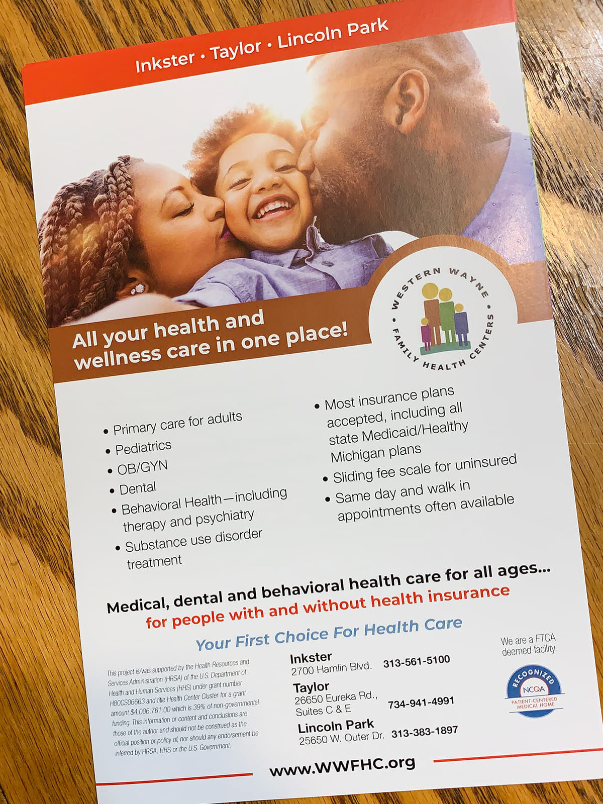
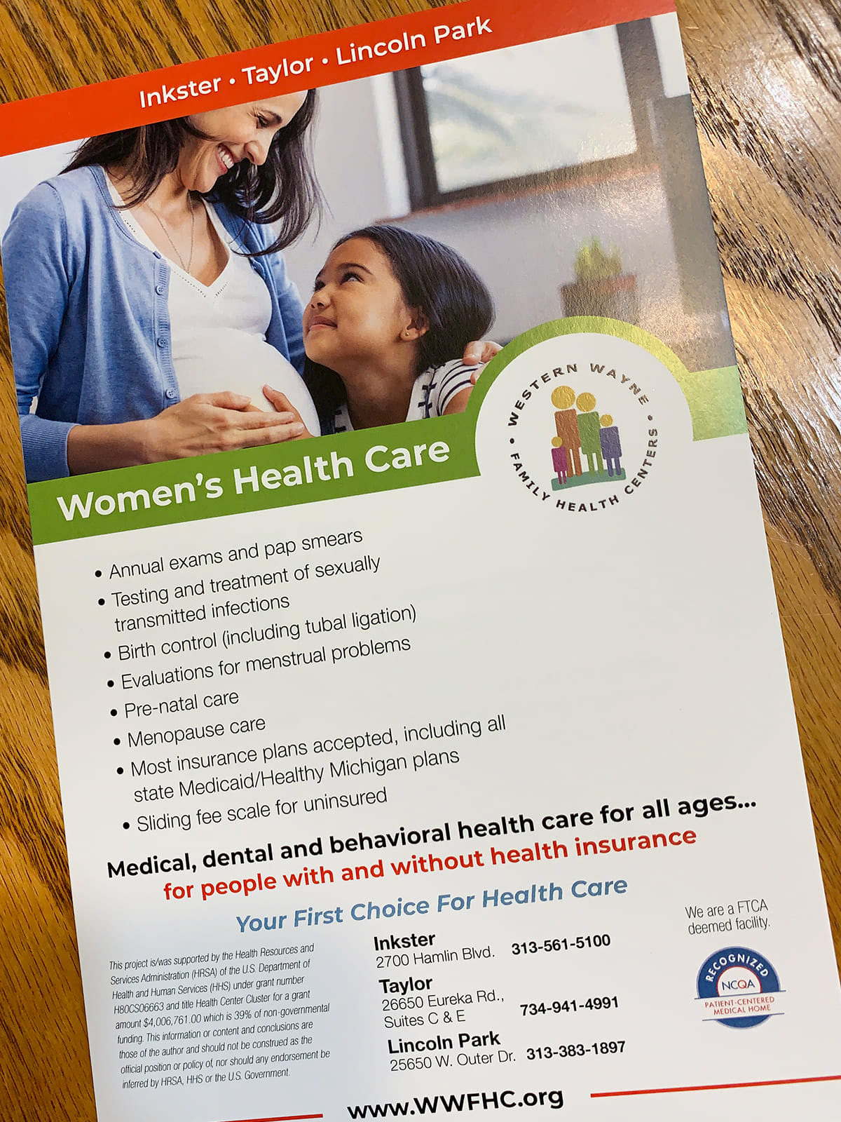
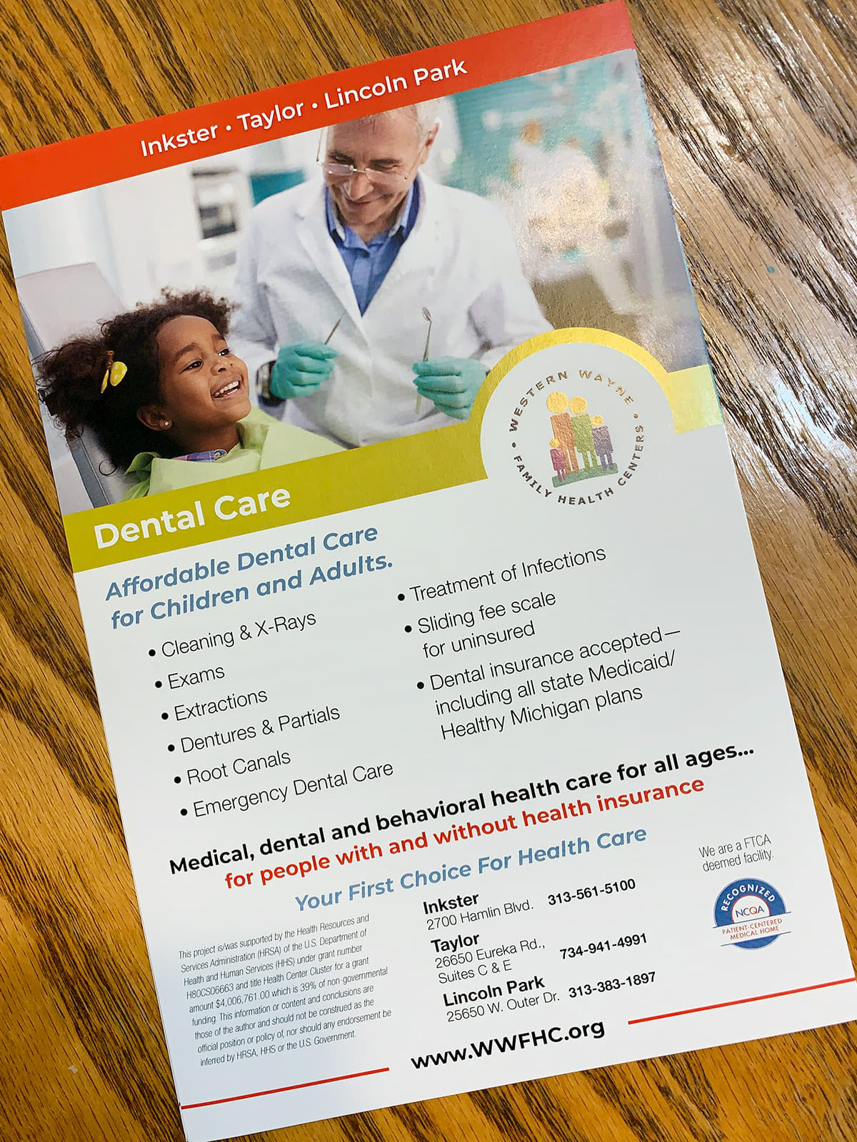
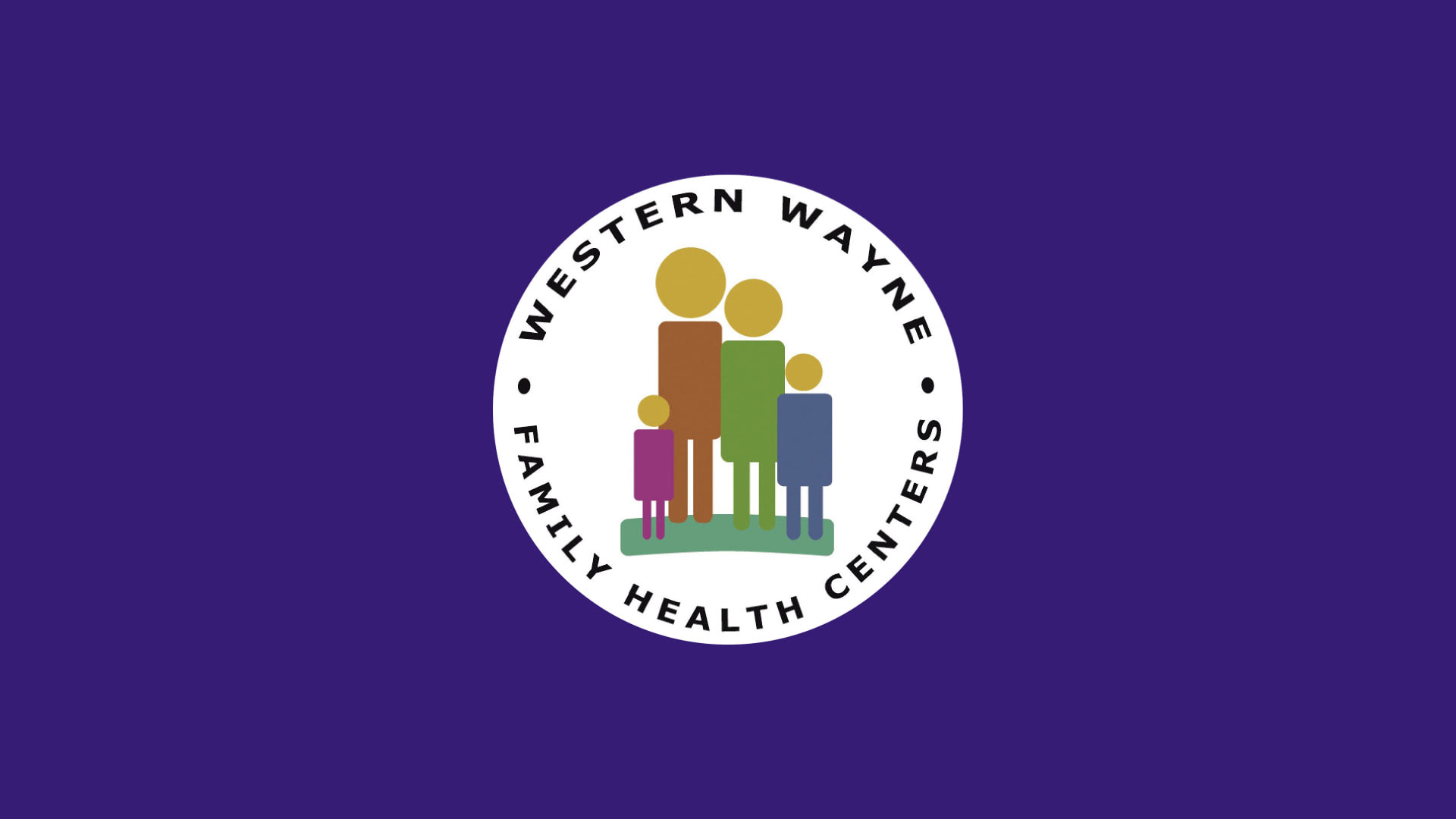
Western Wayne Family Health Centers (WWFHC) offer high quality, accessible primary health care for all. With centers in Downriver Detroit, their services include primary health care to all ages, OB/GYN, general dentistry and integrated behavioral health.
Objective
As a result of a previous game board project that we worked on for them, WWFHC asked us at the end of 2018 to develop a brand identity guide based on their existing logo. They felt that many of their promotional materials for their different services were not visually cohesive and they wanted us to create a document that would help to unify their brand in terms of visuals, typography and messaging.
Role
I worked with my managing director on this project, and we started by evaluating their existing promotional materials.
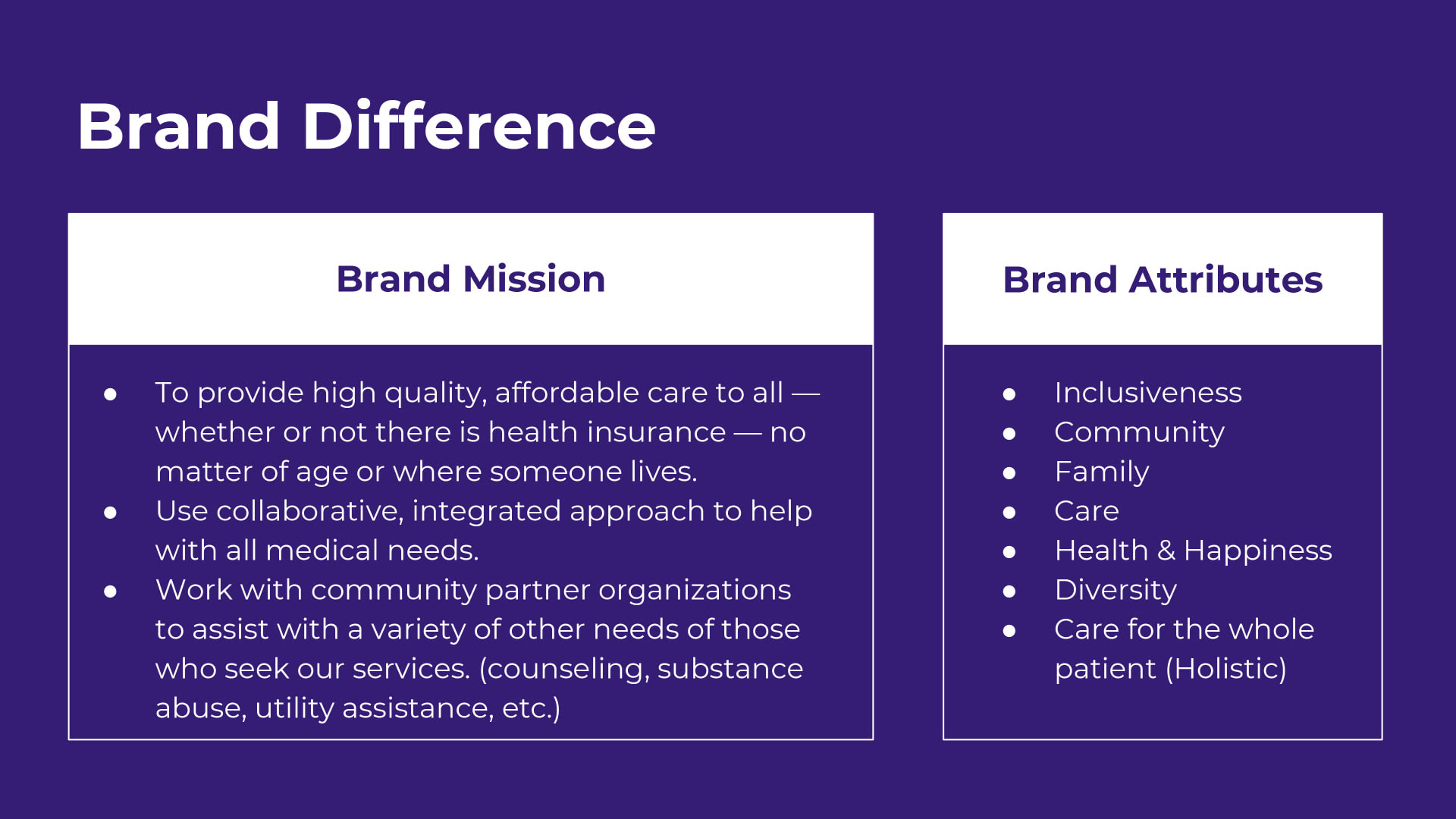
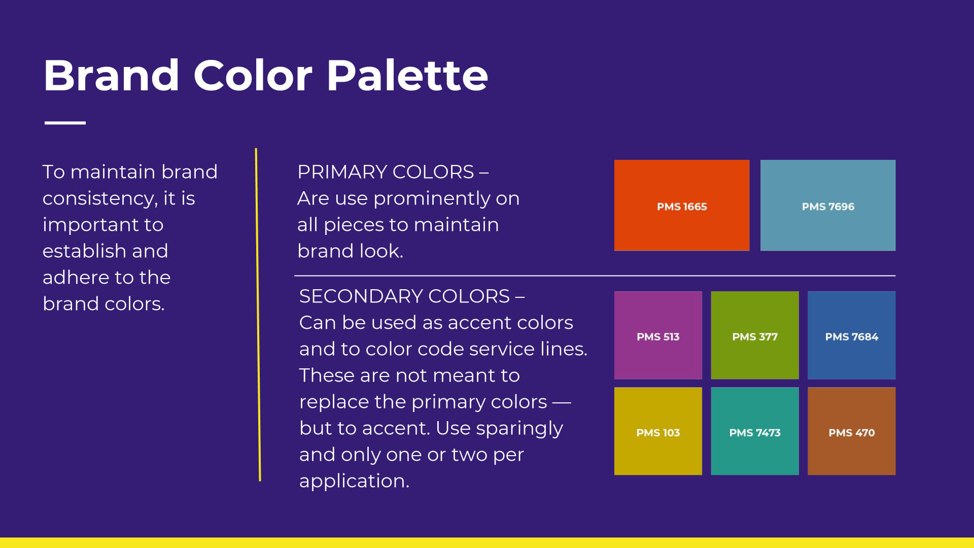
While my managing director developed the brand mission/attributes, taglines, content and imagery guidelines, I developed the typography choices as well as picked the Pantone colors for the primary brand colors and secondary accent color palette.
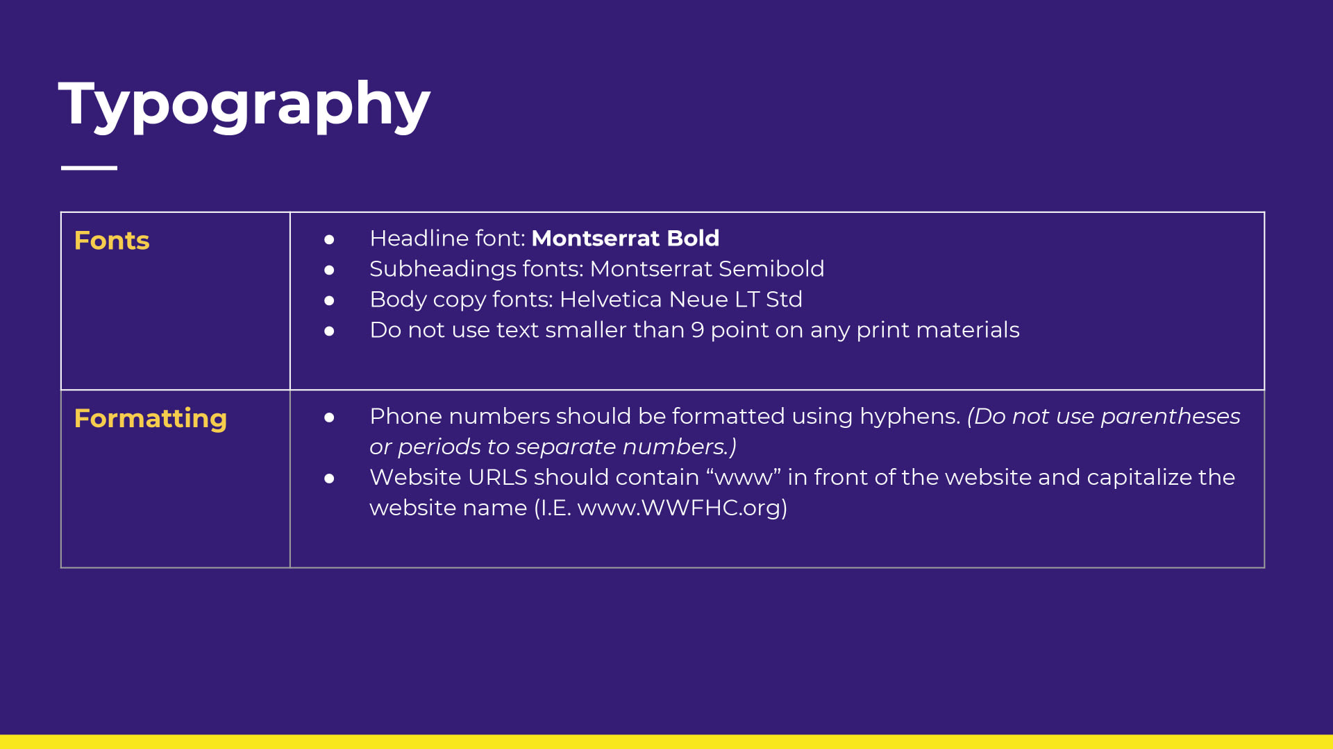
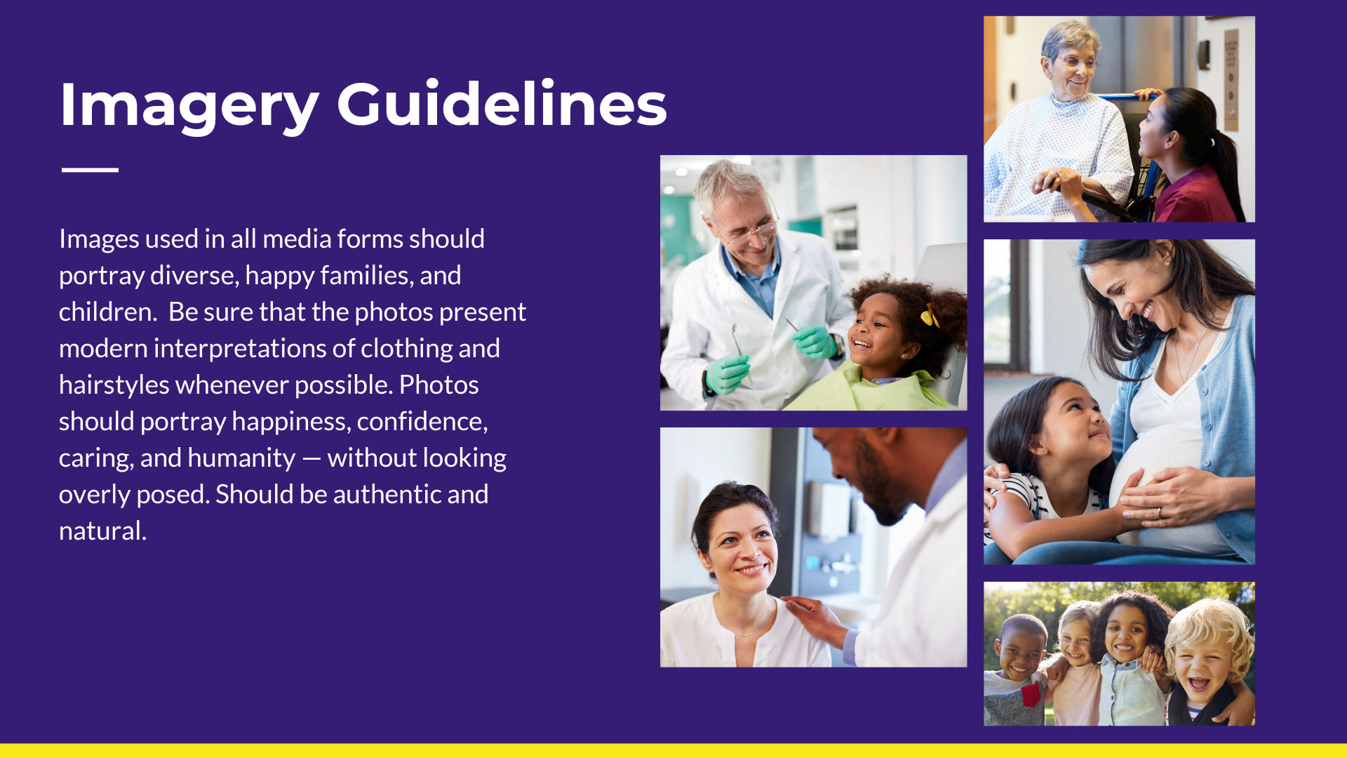
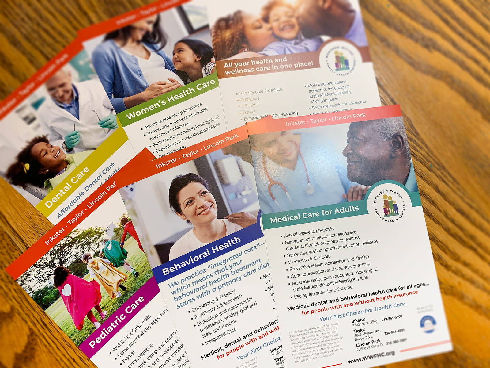
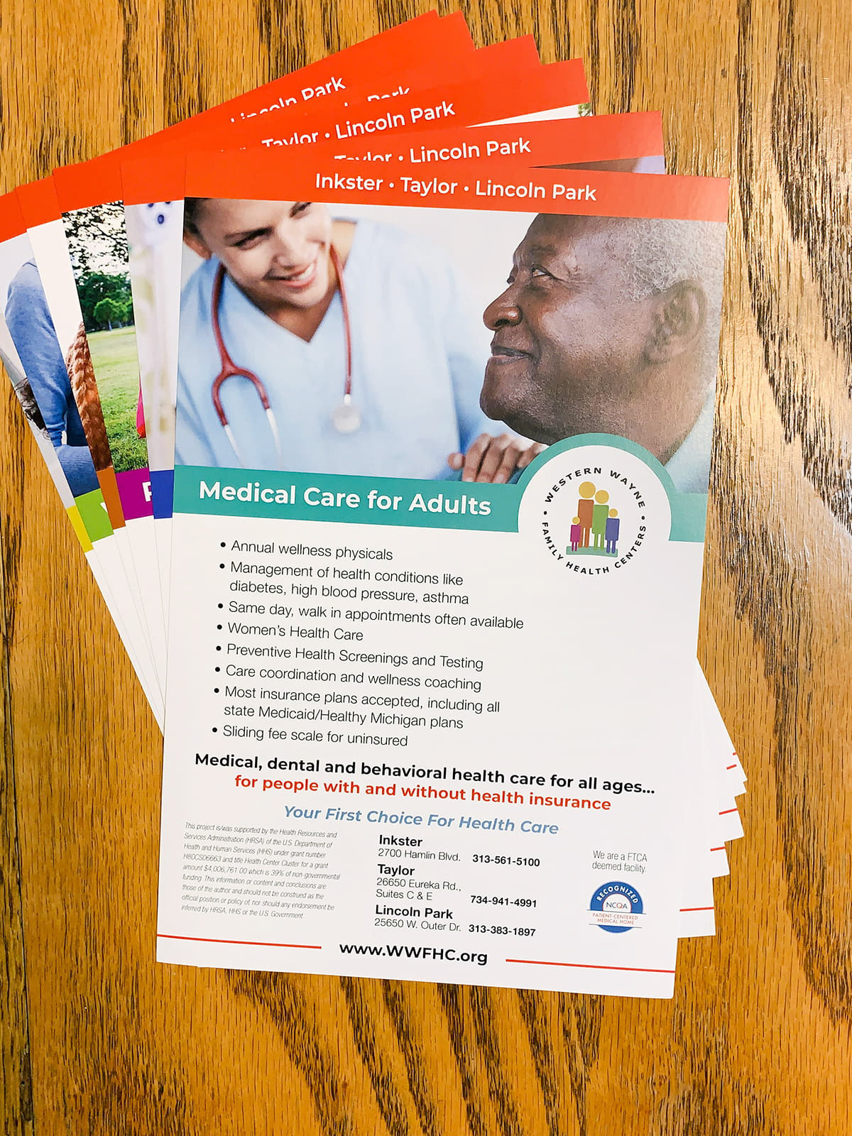
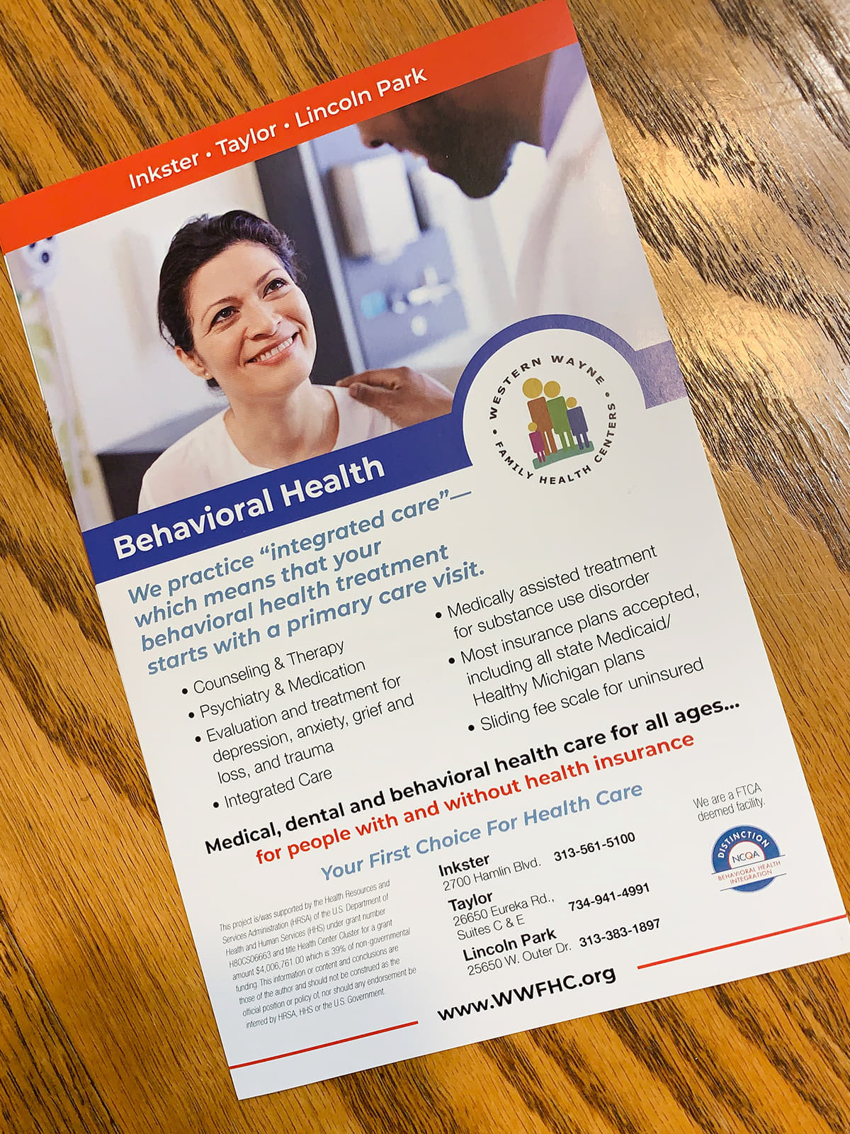
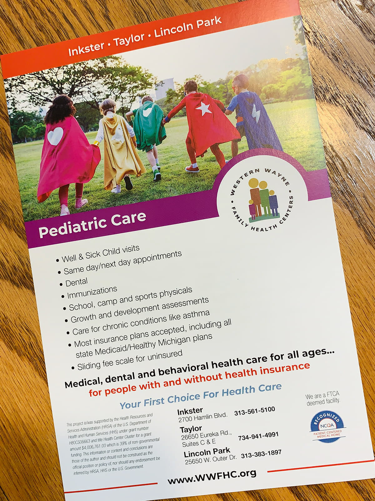
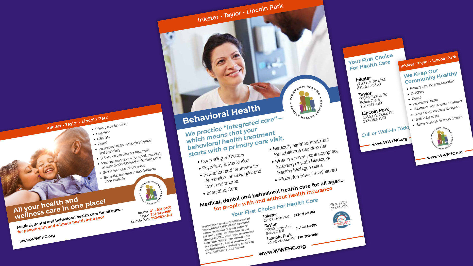
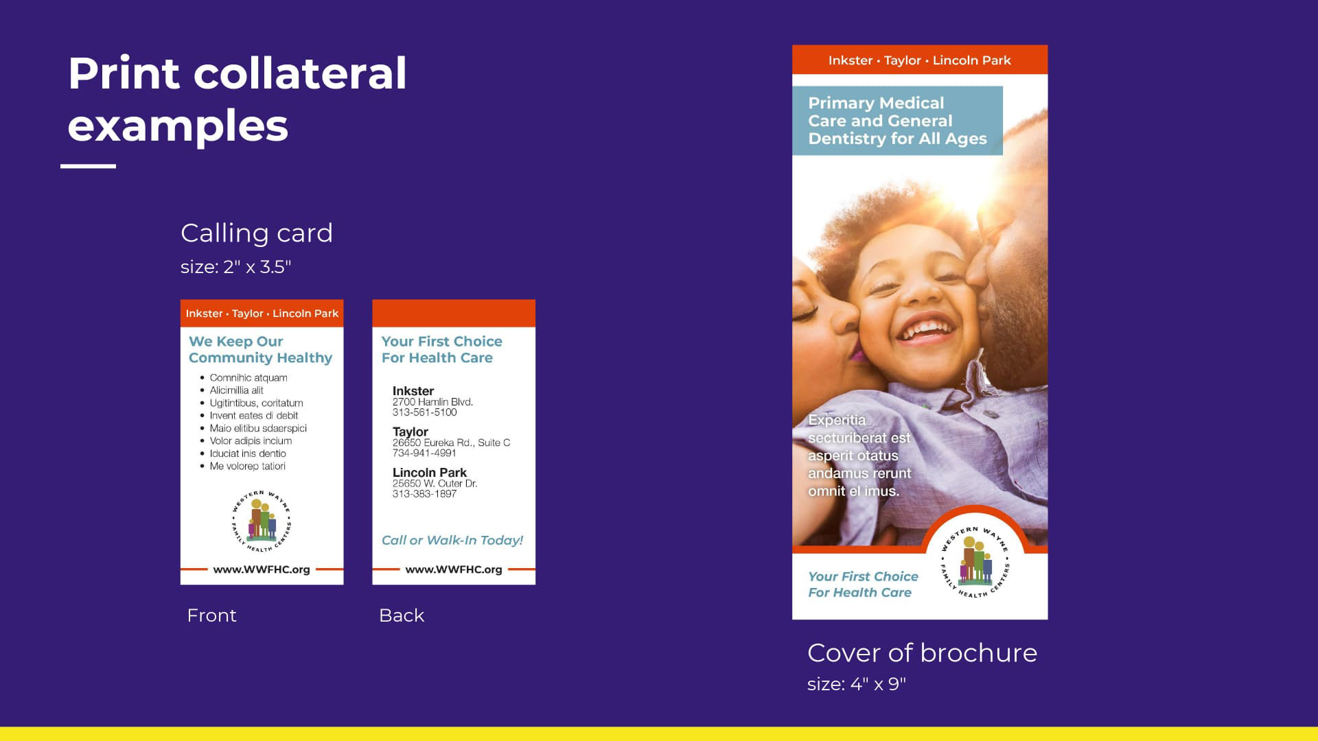
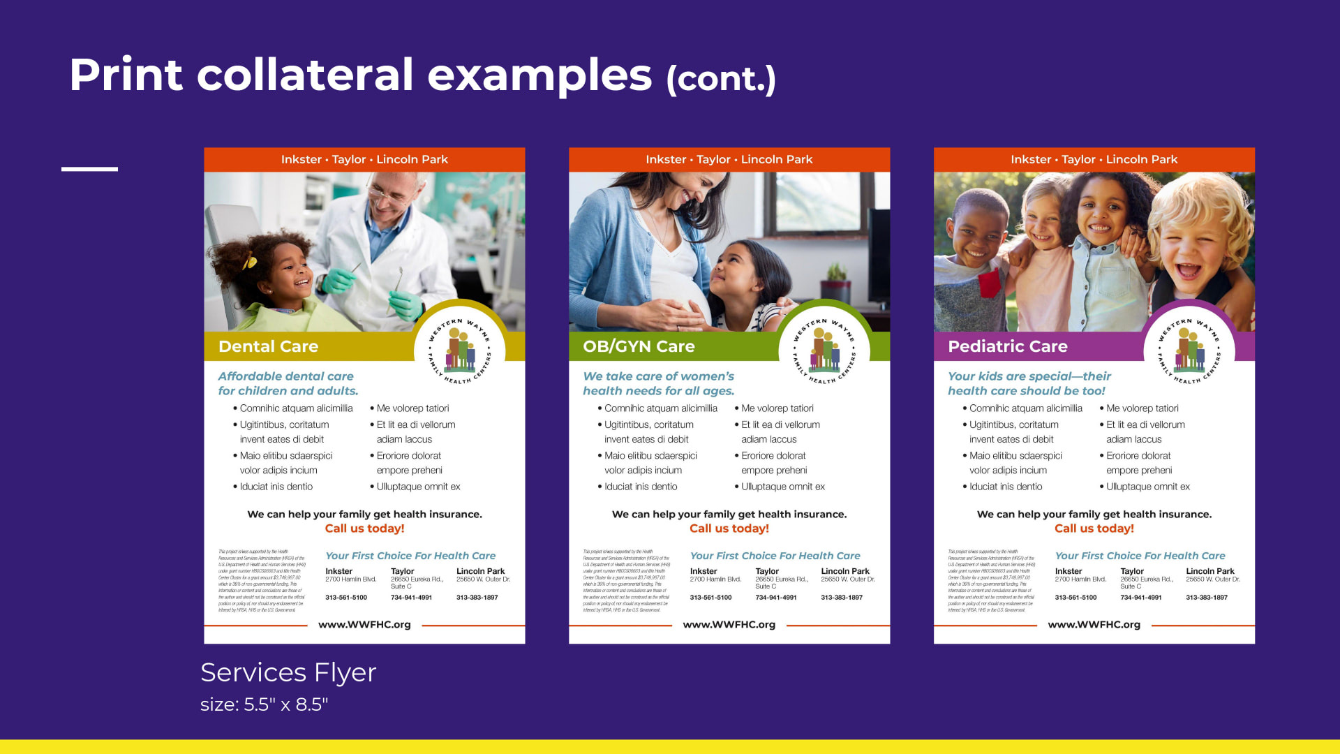
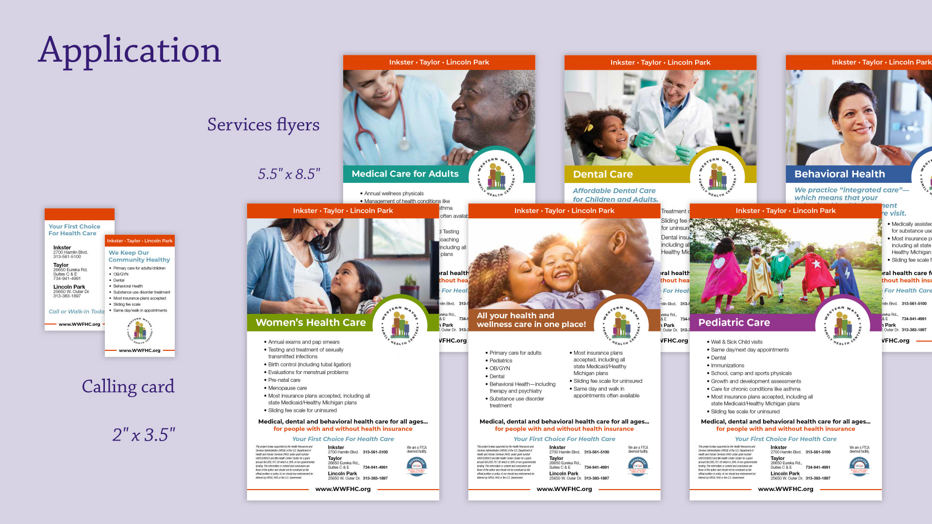
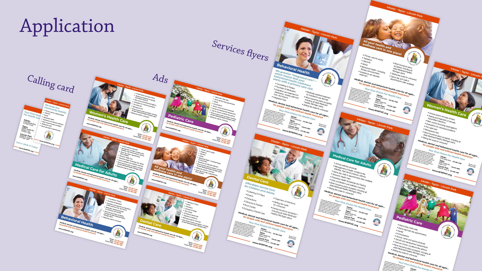
I also adapted the imagery guidelines to produce samples for printed collateral—the calling card, brochure and services flyers. After approval, we delivered the guideline document electronically to our client for internal review and feedback.

Results
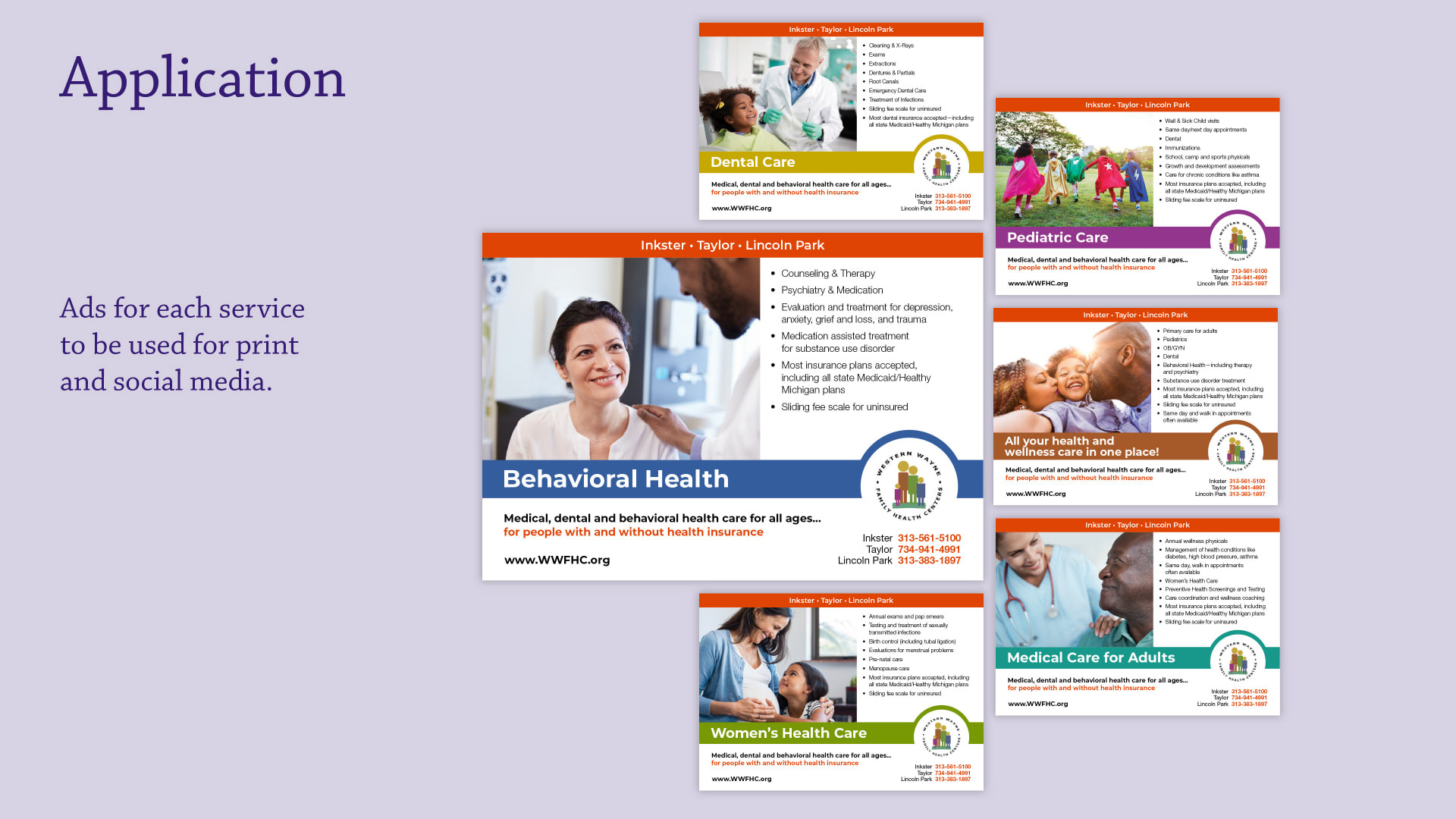
Our client approved the brand guidelines, and in 2019 contacted us for a future project where I designed and we produced the full range of services flyers, and their calling card. We also adapted the layouts of the services flyers to additional images for social media.
We successfully created an identity system that helped to unify the look and message of the services they offer going forward.