Project
Logo design and brand guidelines
Client
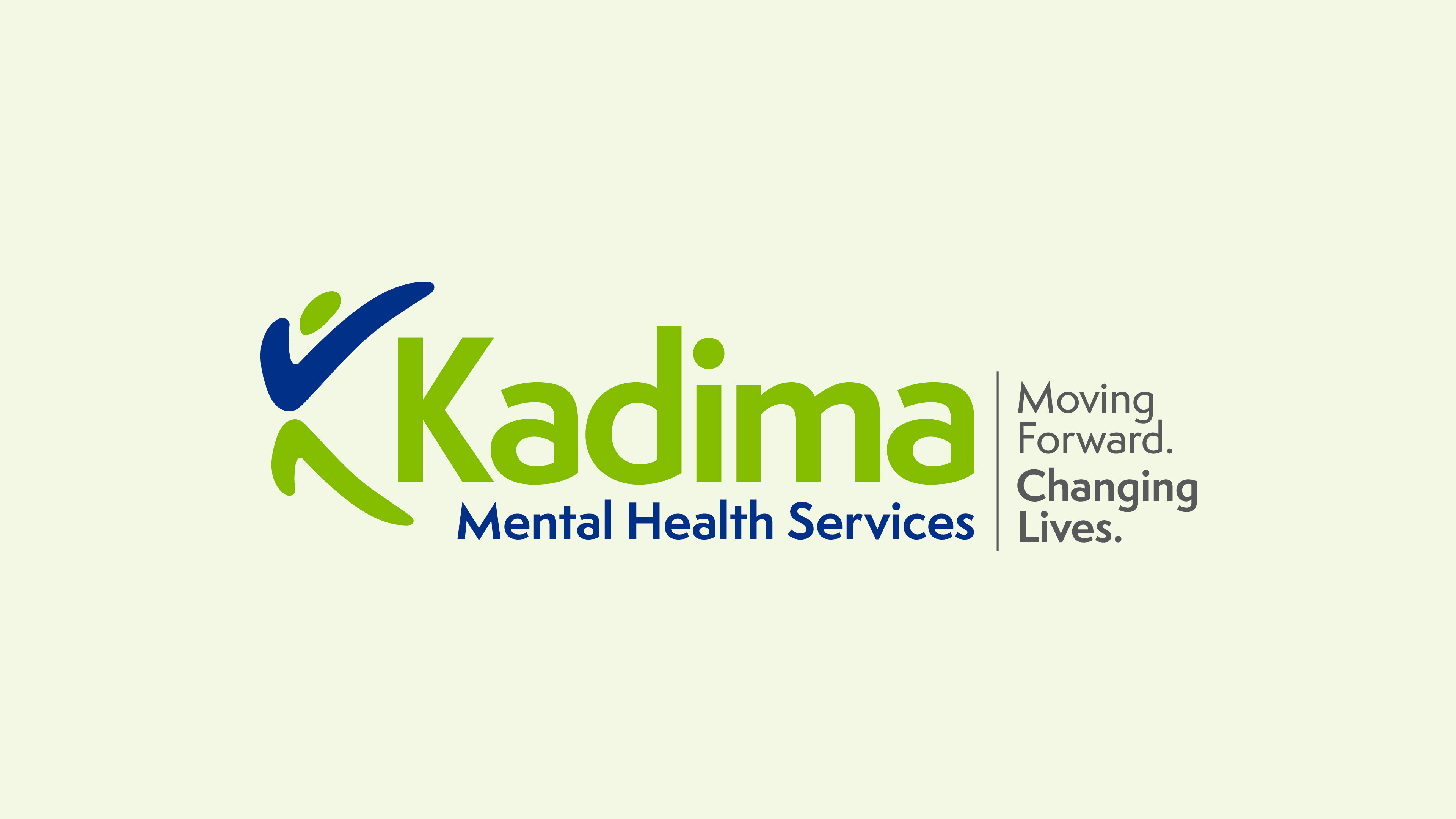
Christian Story Lab. A Christian newsletter focused on story and strategy, with the goal of helping leaders master marketing and storytelling in a way that honors both people and God.
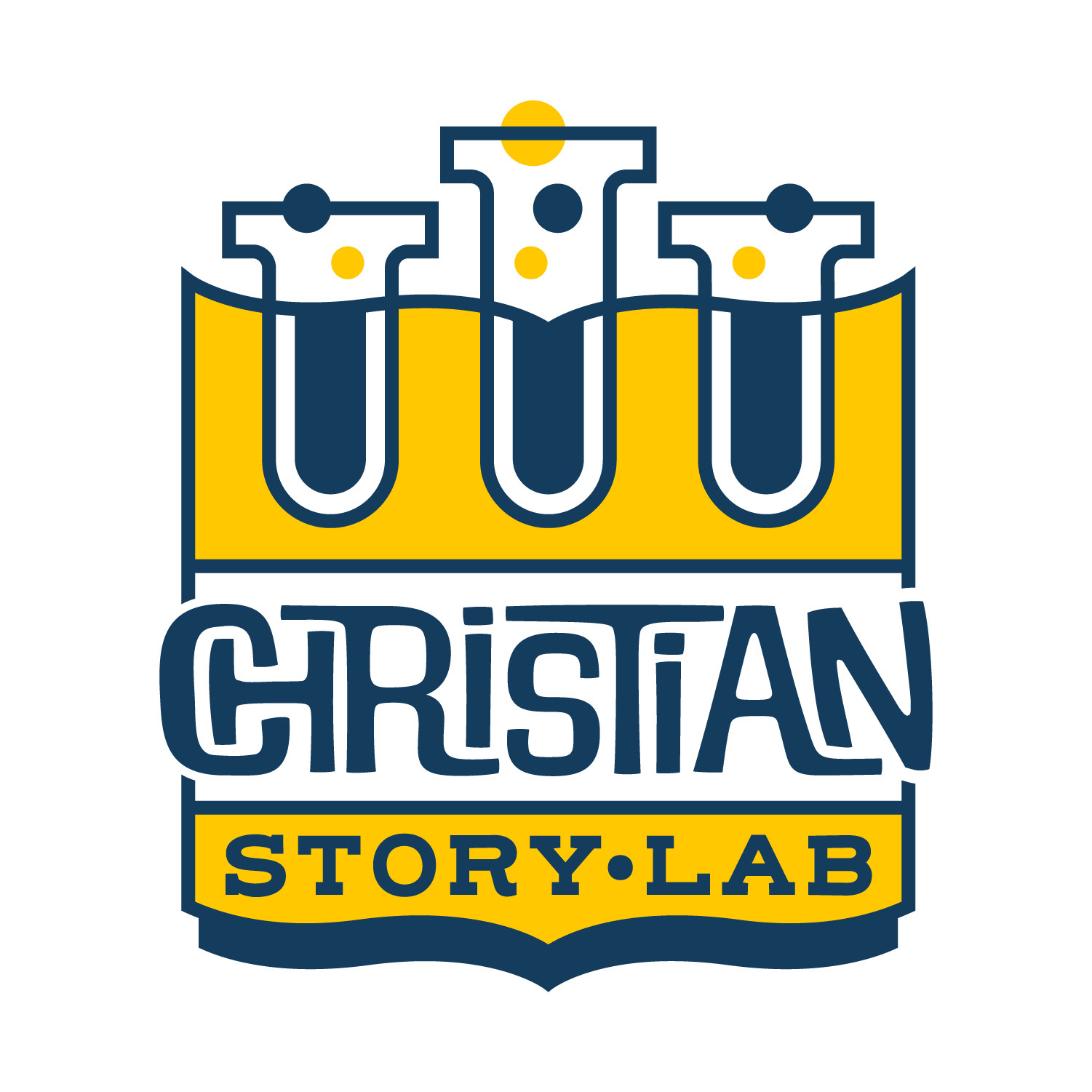
The owner of Christian Story Lab is a local church pastor as well as a copywriter and marketing manager. He had recently started a newsletter/community for Christian story tellers, and approached me about creating a fresh brand identity to replace the stock logo he had been using—which included a primary logo for 'Christian Story Lab', and also a secondary logo for his members community, 'The Lab'.
My approach to designing a logo starts with writing down the company goal/mission and sketching out possible visual associations between the key words. I like to combine one to two visual associations to make a distinct concept that is easy to read.
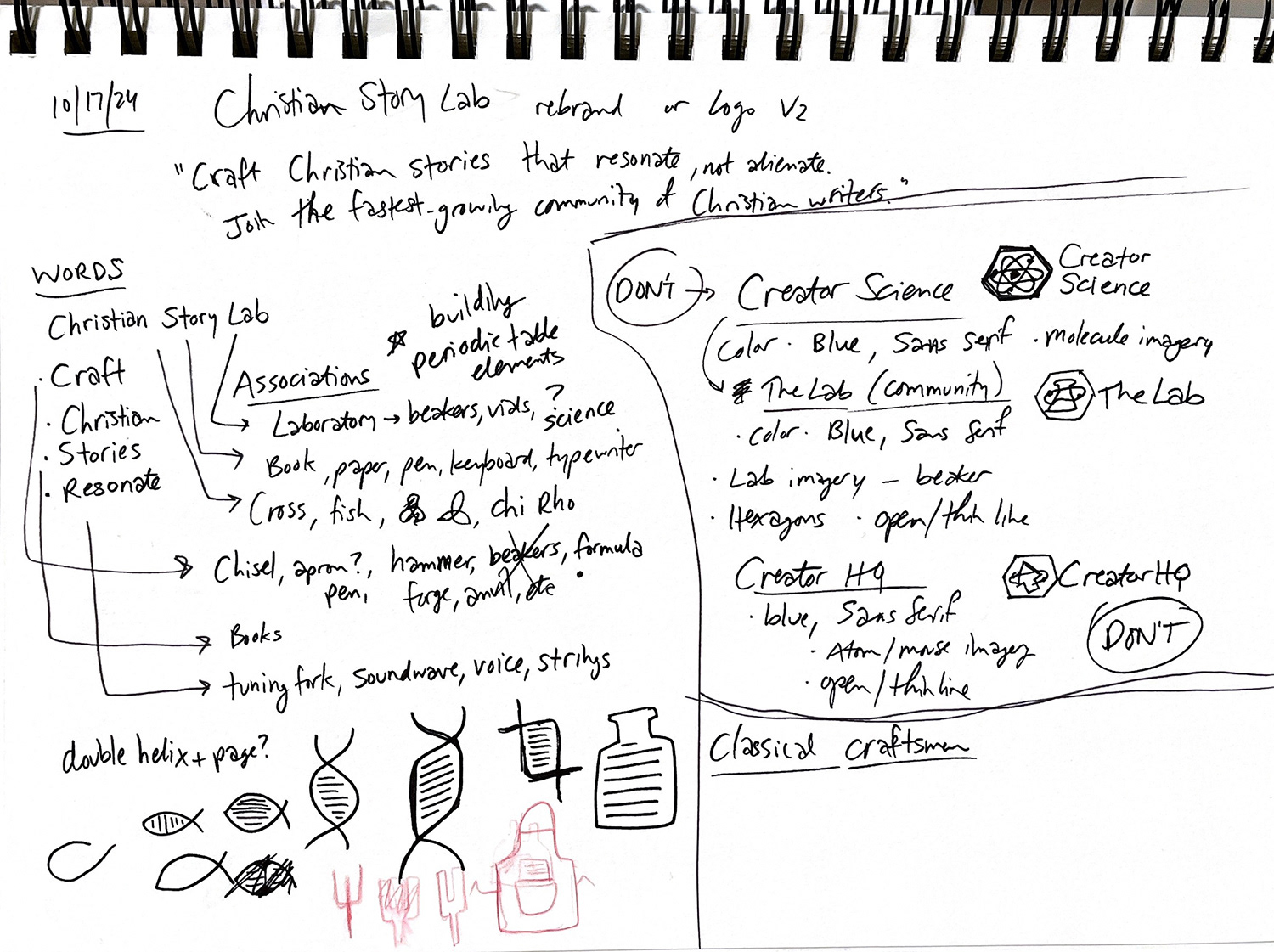
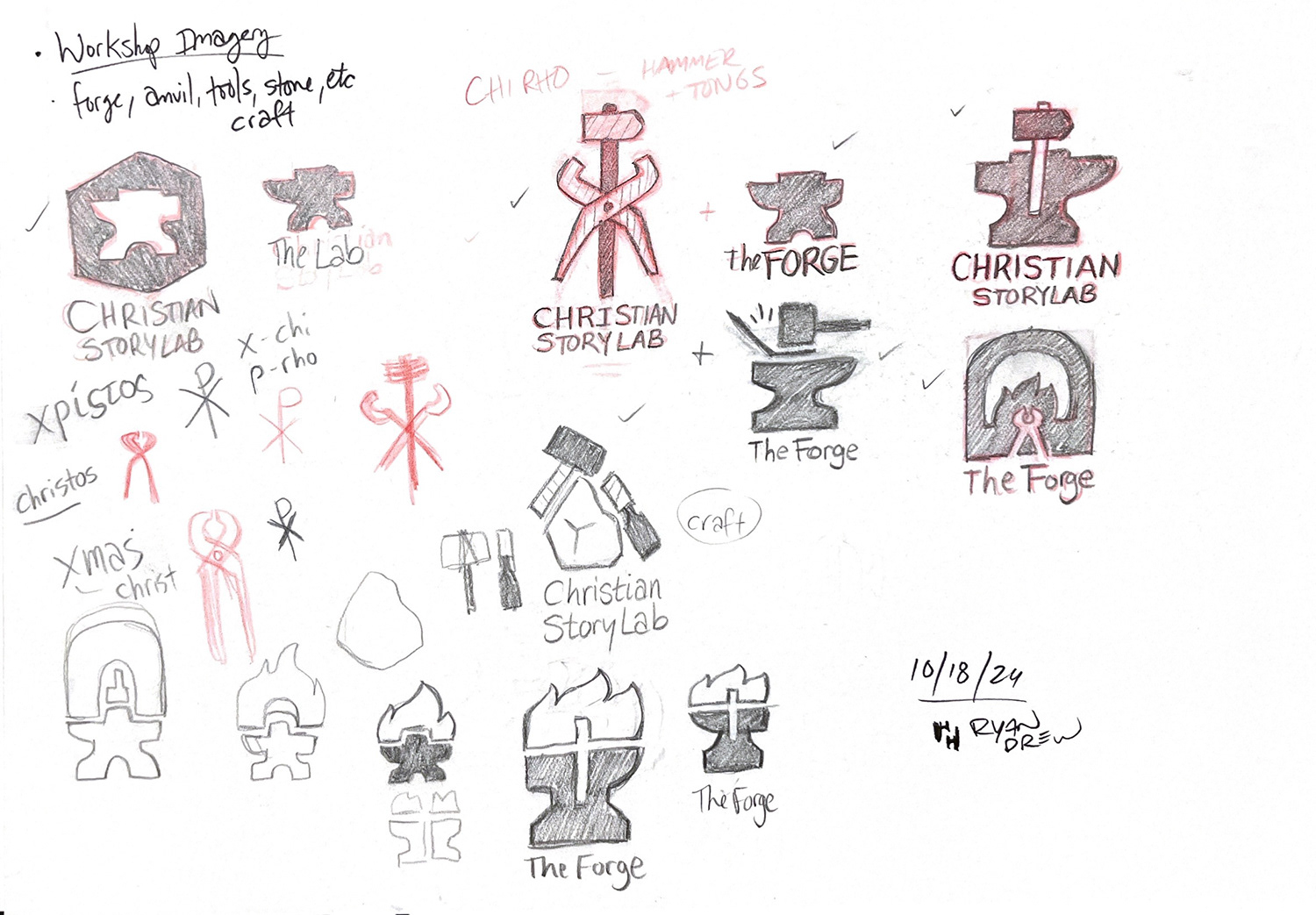
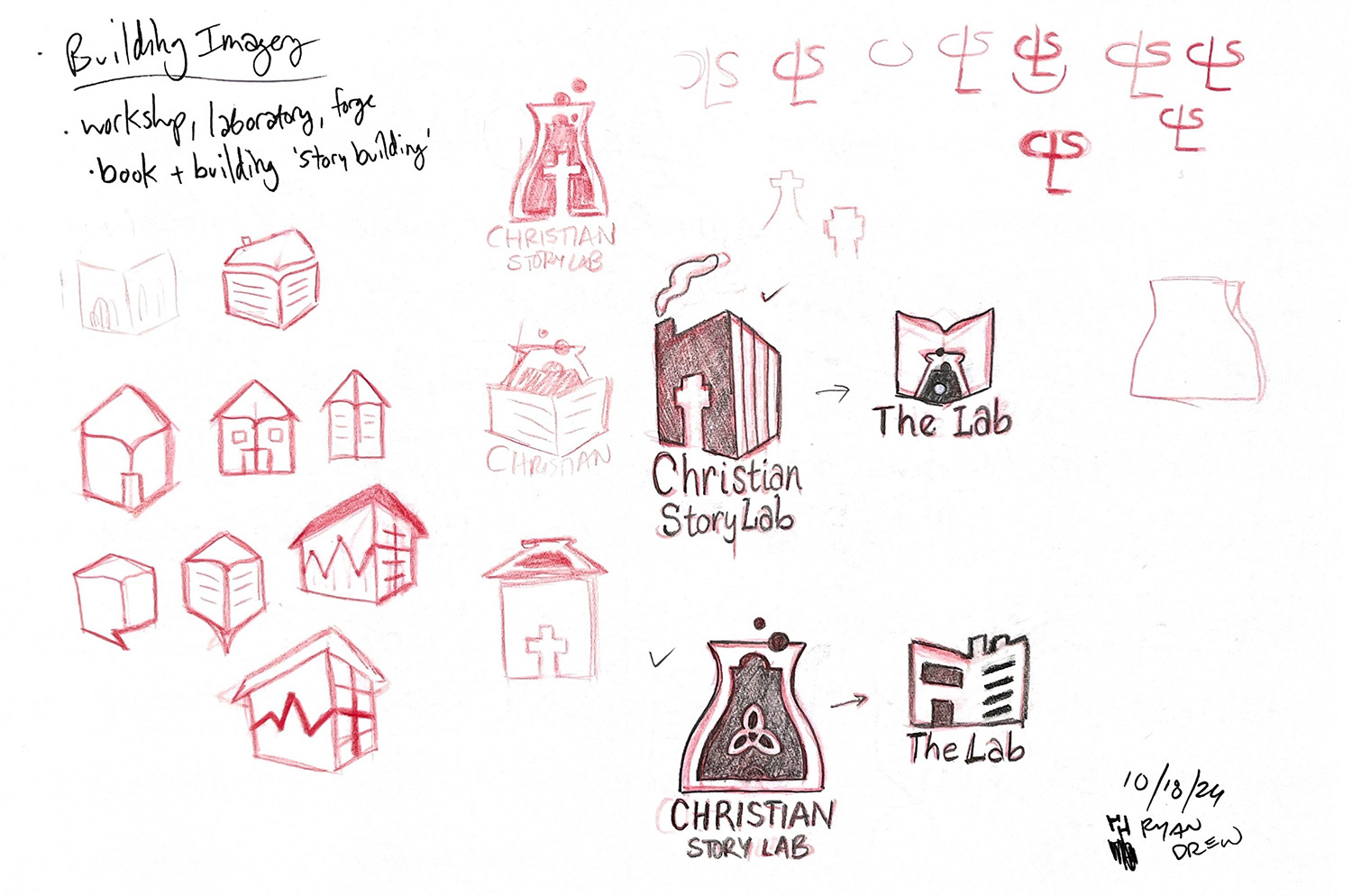
Once I had a handful of decent ideas, I started developing the primary and secondary logos for each concept and presented the sketches to my client for a first review.
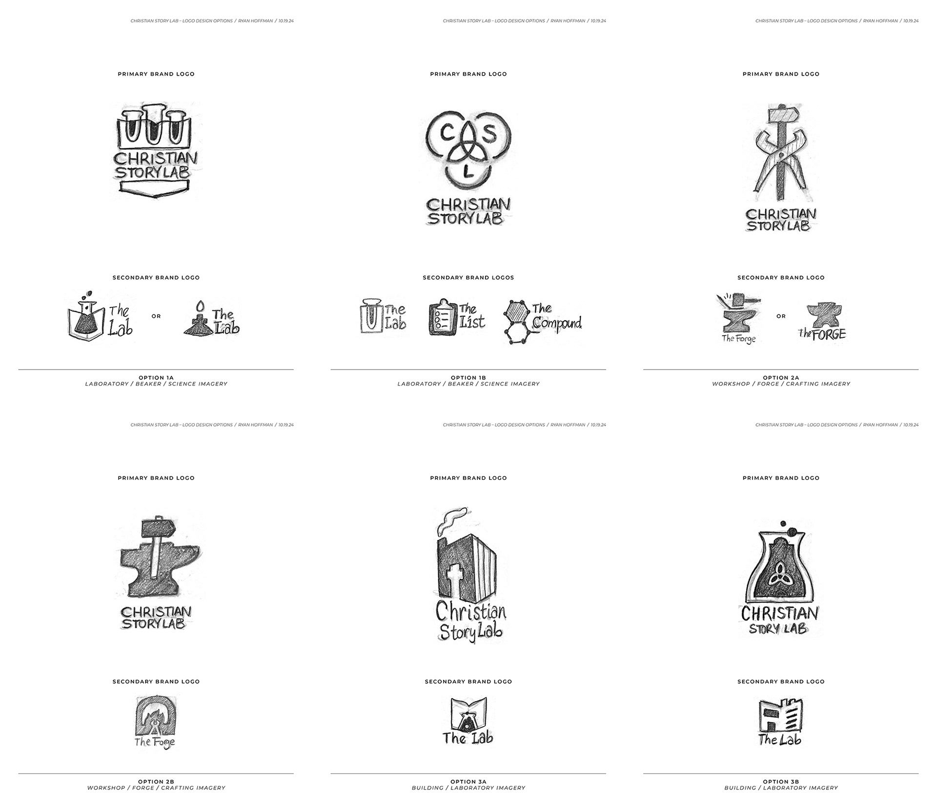
Sketch Options
My client chose the first option. They wanted the logo to visually emphasize 'Story' (book) and liked the visual connection between the beakers and 'Lab', and how they intersected with the book icon. They also chose the first option for the secondary logo from this concept, to stay closer to the primary brand icon.
Round 1
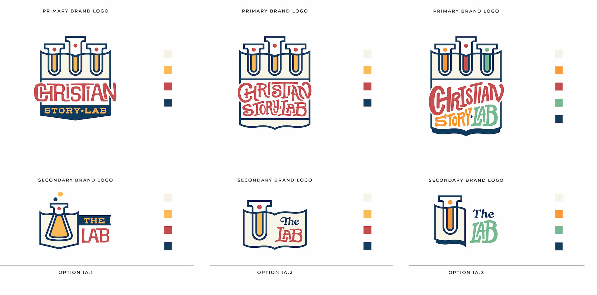
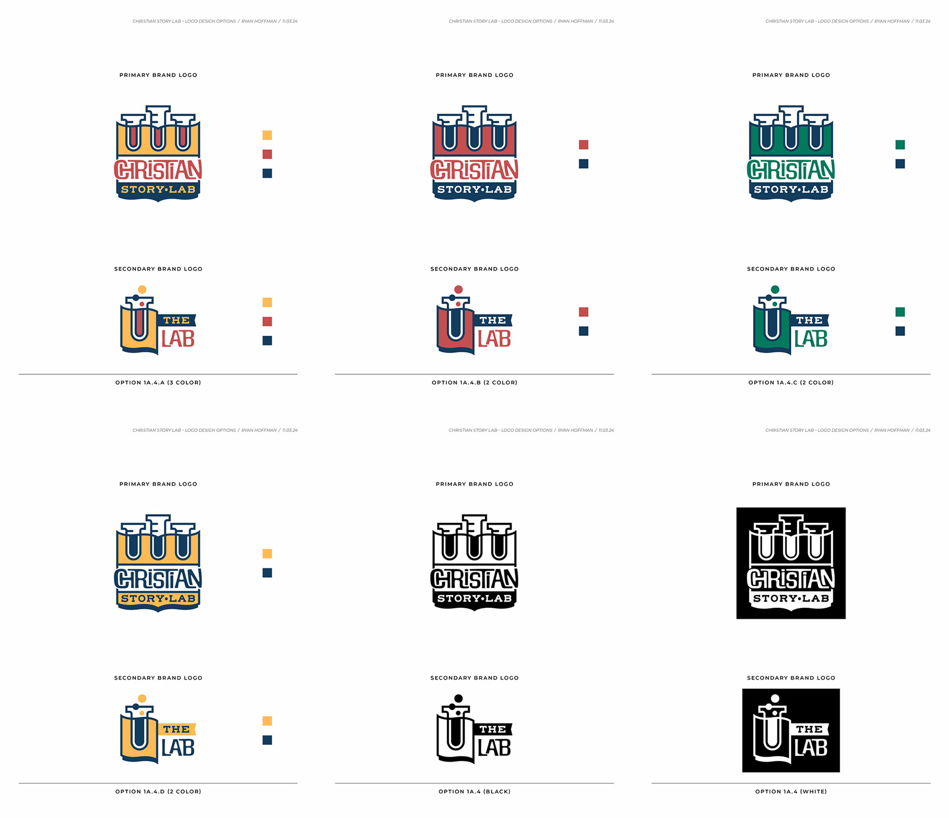
For the first round of revisions, I took the chosen pencil sketches and worked them up as vector art in Adobe Illustrator. I introduced color options and different ways to treat the logotype for the primary logo, with a mix of typeface options and hand drawn typography. I also included three options for the secondary logo to complement the primary logo options, and sent the three revised options off to my client.
Round 2
Second round of options presented after making client's changes to the chosen option from the last round. The goal was to figure out the color palette, and using three colors vs. two colors. I presented these options to my client for the second round.
Round 3
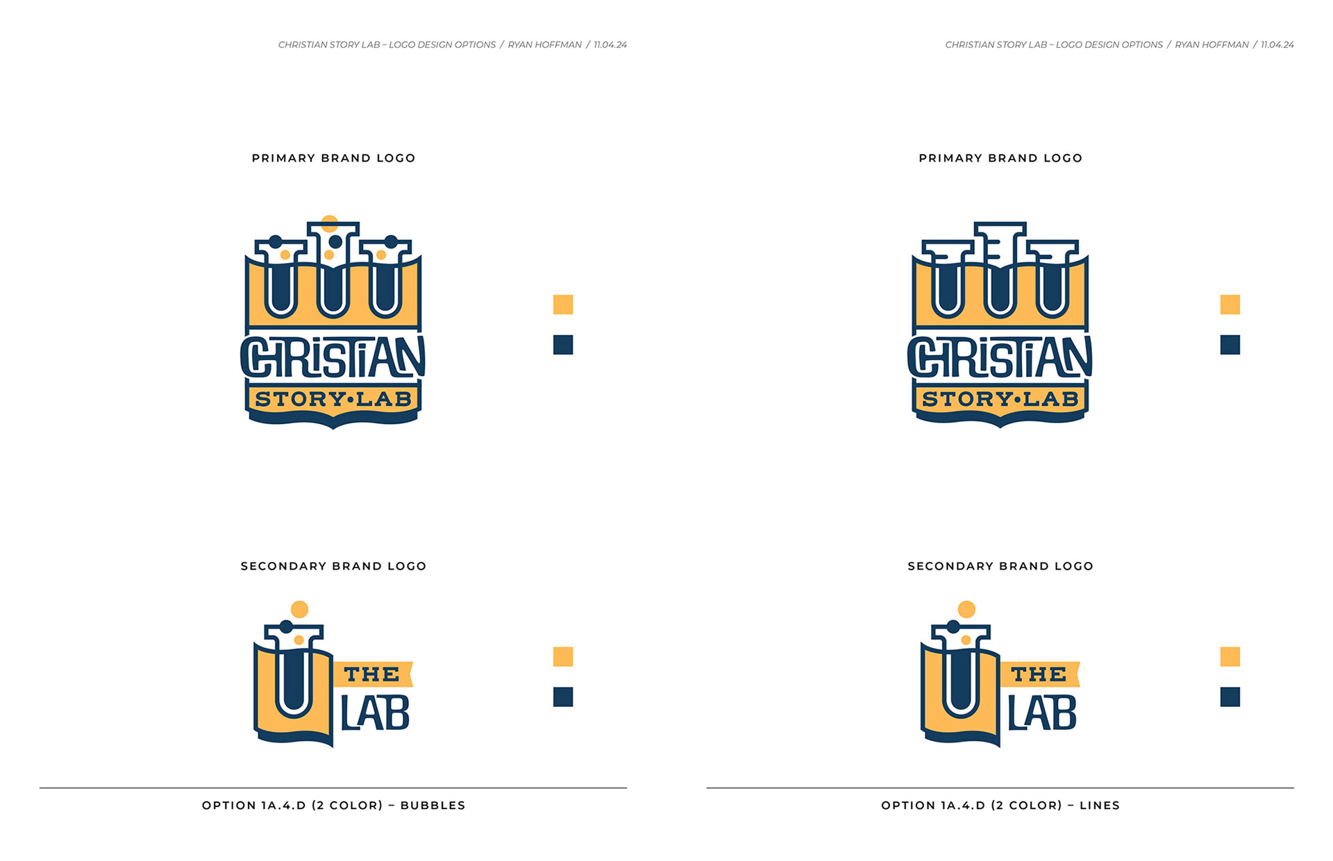
Third round of options focused on using bubbles vs. lines for the beakers in the primary logo, and my client chose the yellow/blue color palette option.
Round 4
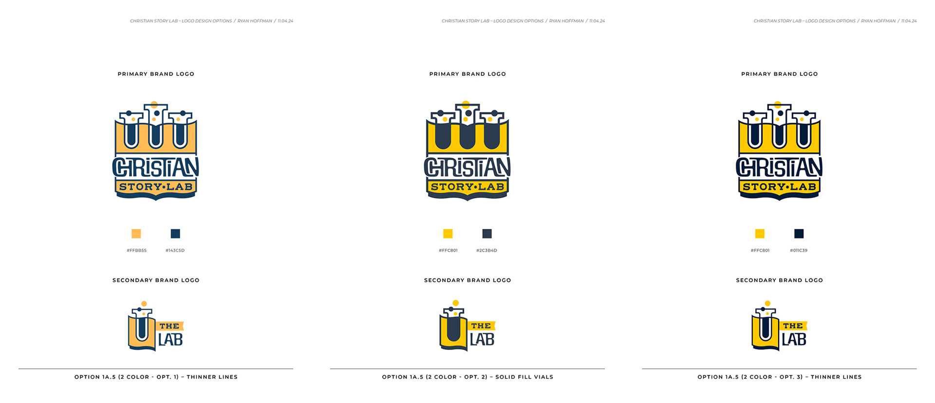
Once my client chose the bubbles for both primary and secondary logos, the goal here was to compare a solid color fill vs. white space for the beakers in both logos, thinner vs. thicker lines in the logos, and to compare different values for the yellow and blue colors.
Round 5
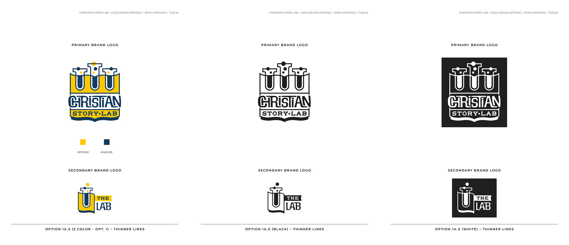
Final round included finalizing the chosen values for the yellow/blue colors, and what the primary and secondary logos look like in full color, one color black, and one color white reverse applications. Once presented, my client approved the logo and gave me the go ahead to send the final logo files and work up the brand guidelines to show the color values, and typography usage.
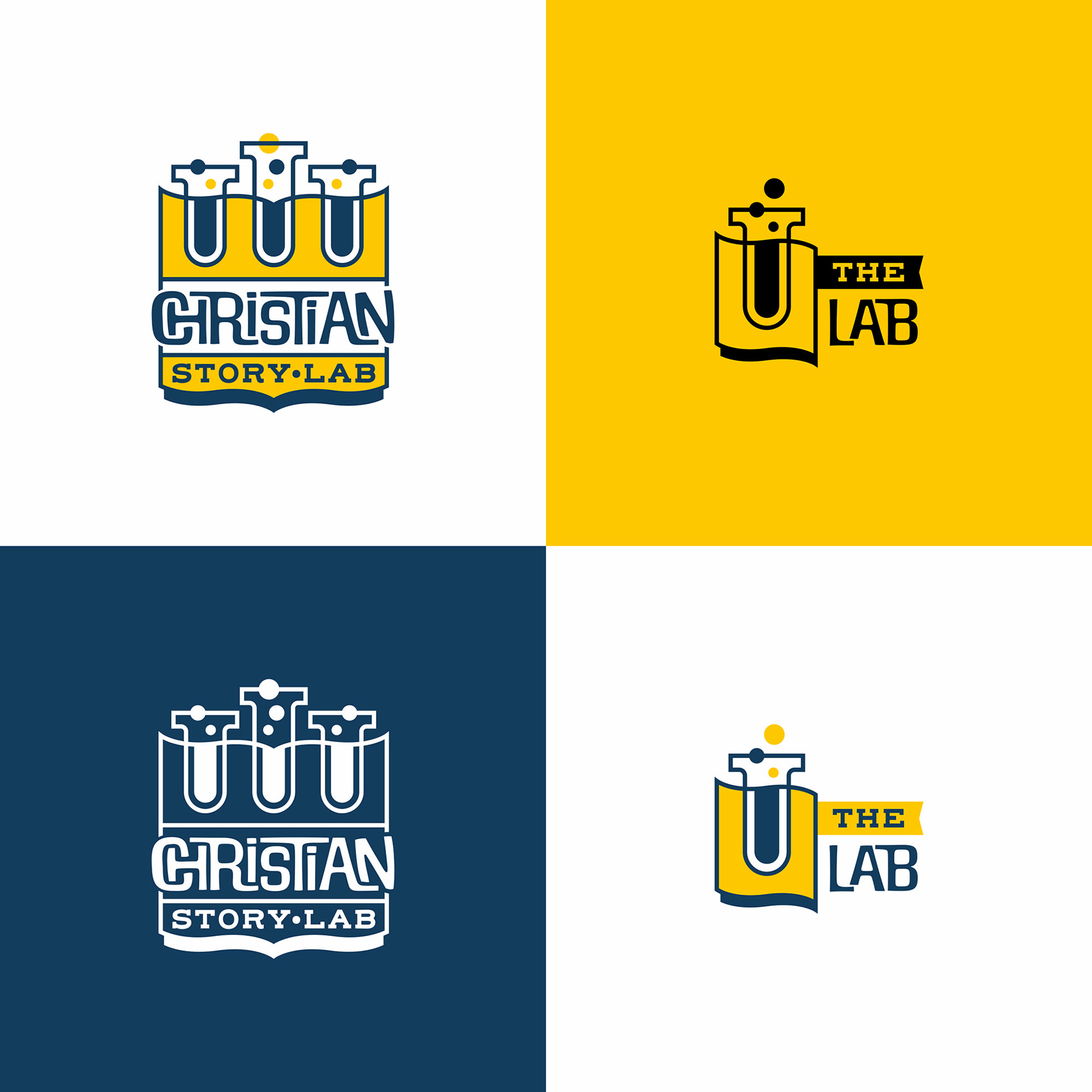
Final logos in different color applications. I sent the finalized high resolution vector files for both primary/secondary logos in various vector and raster file formats for print and digital use.
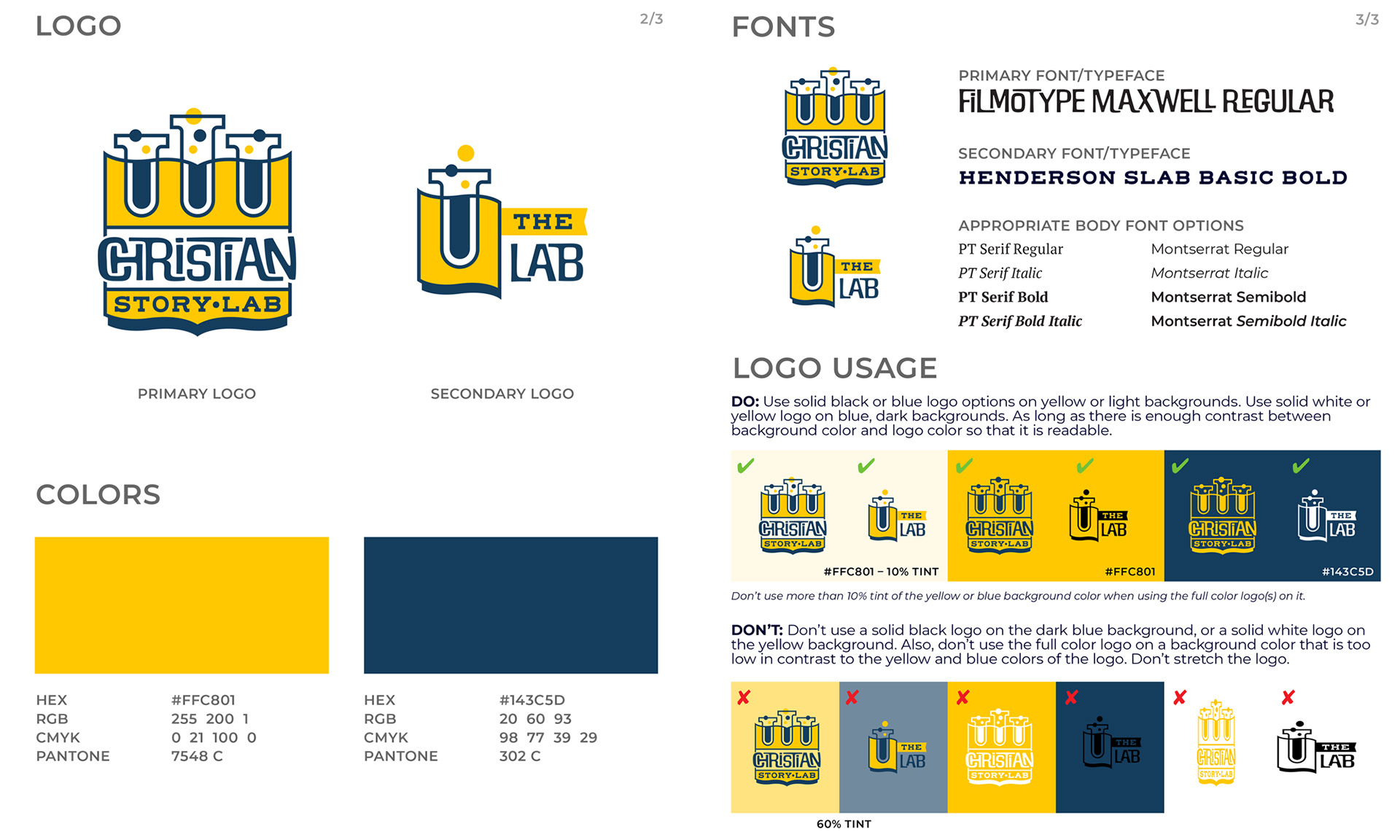
I also sent a short brand guidelines document that listed the approved brand colors in HEX, RGB, CMYK and Pantone values, as well as which typefaces should be used for headlines, body copy, etc., and how to/how not to use the logo in different applications.