Project
Rebrand
Client
Crown Staffing Solutions, a certified woman-owned business in Michigan that provides comprehensive employee placement, consulting, and specialized services to companies primarily in the Michigan/Ohio area.
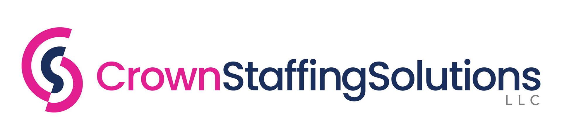
Horizontal Logo
Stacked Logo
Having used the same logo since their inception in 2016, they decided to update their look once they planned to adopt a new name in 2025, 'Saramar Staffing LLC'. They needed a logo refresh to incorporate the new name, as well as some other additions—incorporating the initials 'SM', as well as using a fuchsia and blue color as their new primary colors instead of the current blue and silver.
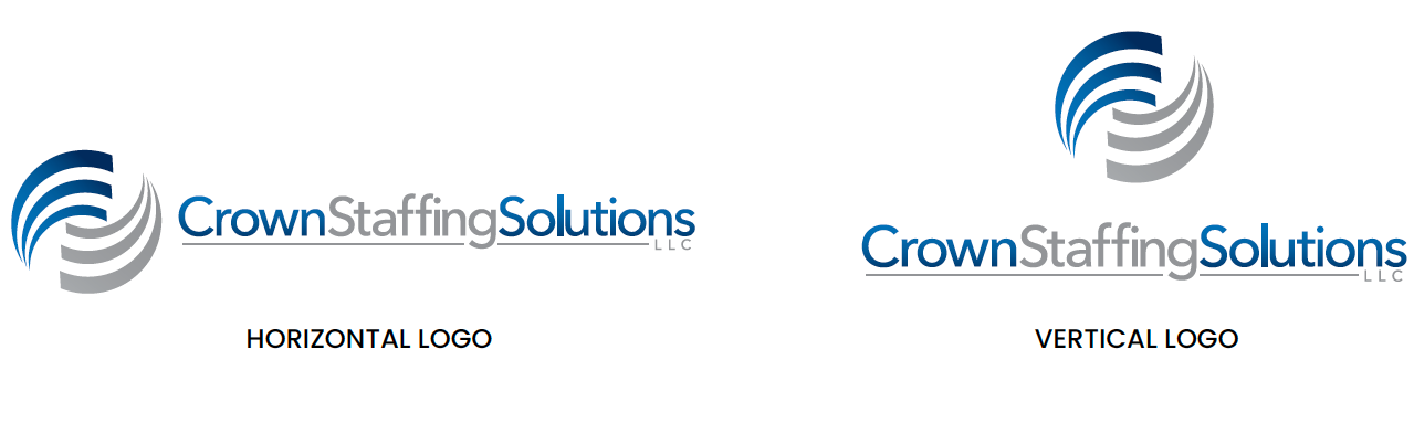
Old Logo
I was tasked with picking up where a fellow designer had left off in this rebrand process and providing a fresh set of options for the client to consider for the new logo. The initial goal of renaming the company shifted as well during the design process, reverting back to the original company name. However, they decided to move away from a logo that incorporated script lettering/initials to instead using their new brand typeface and a distinct logo icon. I went through several rounds of iterations of logo icons before the client settled on one that they all favored—a stylistic target symbol that I bisected on an angle and shifted so that the pieces subtly formed the initials 'CSS' for Crown Staffing Solutions'.
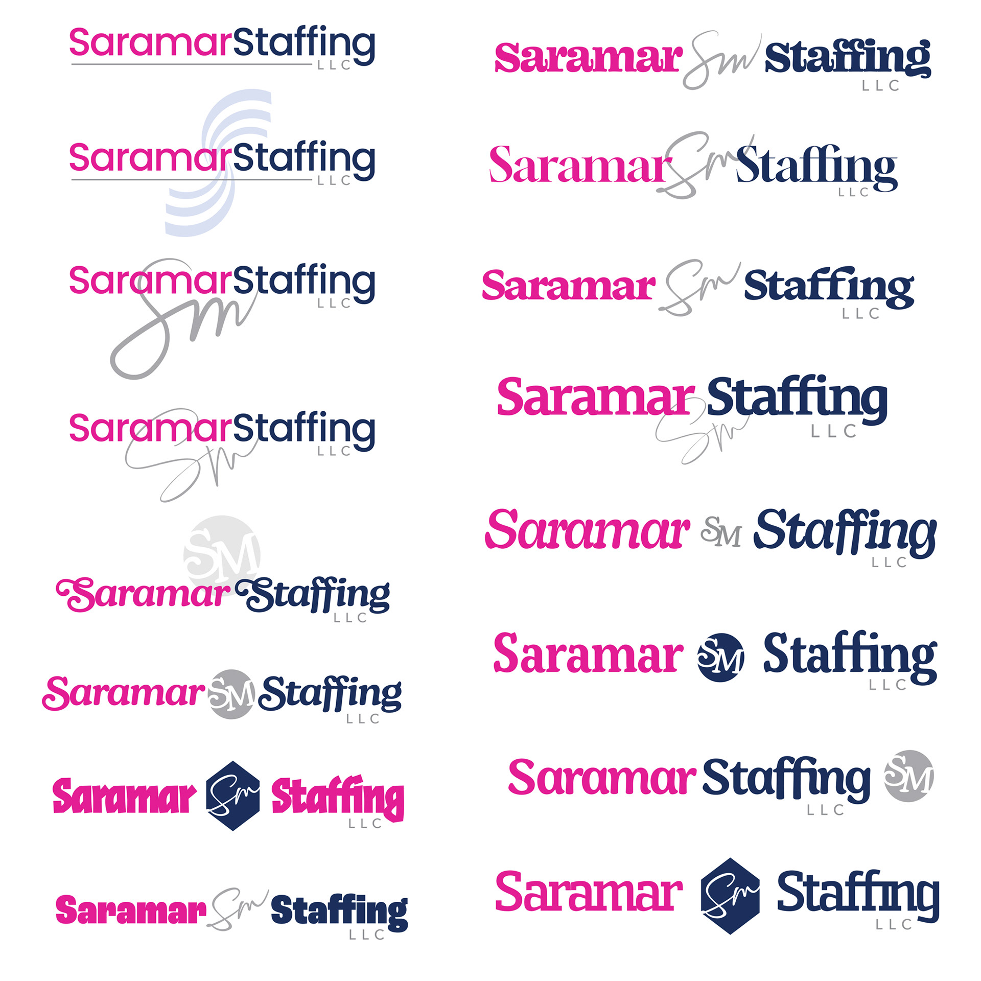
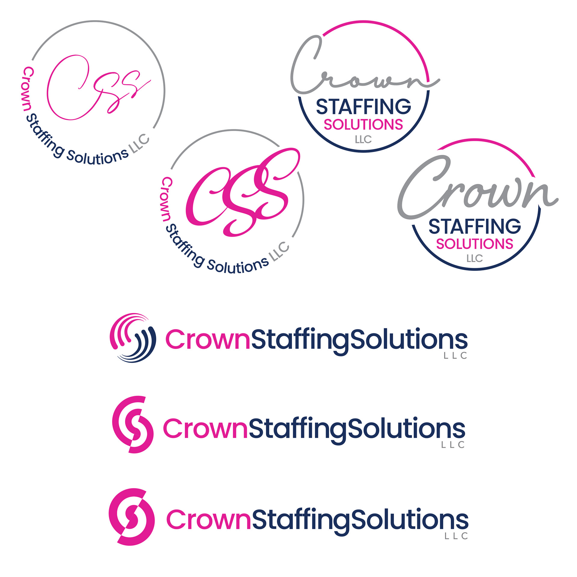
Round 1
I threw out multiple options including the 'Saramar Staffing' name and the initials 'SM'. I included options that featured the initials in various handwritten and script typefaces, as well as different options for the main logo typeface and icons. We presented this to the client for review/approval.
Round 2
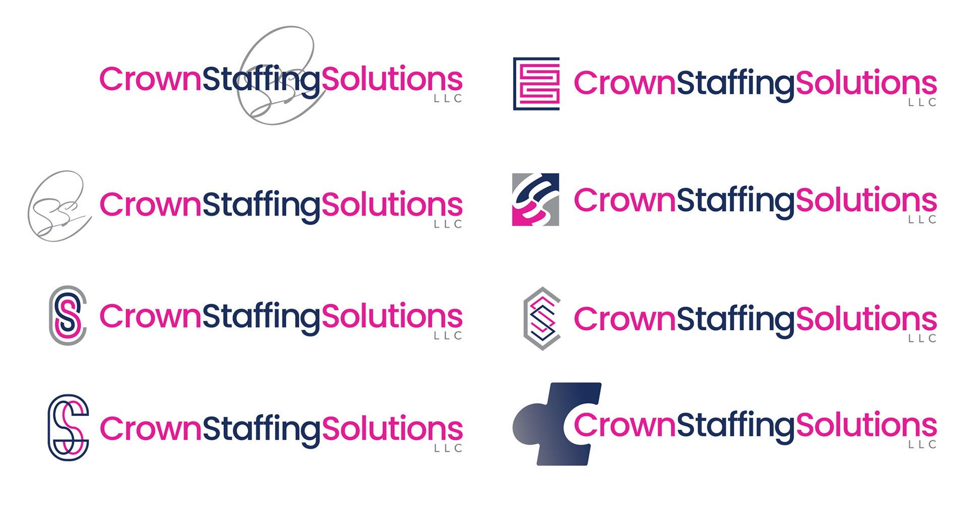
At this point, the name had changed back to 'Crown Staffing Solutions', and they no longer wanted to use the 'SM' initials. Instead, the main brand typeface was locked in, and the goal for this round was to see a range of treatments for the logo icon that incorporated the initials 'CSS'. This group of options went on to the client for review.
Round 3
None of the previous round's options were chosen, the client instead wanted to see more treatments that featured the 'CSS' initials more prominently, as well as some new options for logo icons. I included a rework of one of the client's 'suggested' logo options, as well as two options that featured a stylistic target icon, and send them back off to the client.
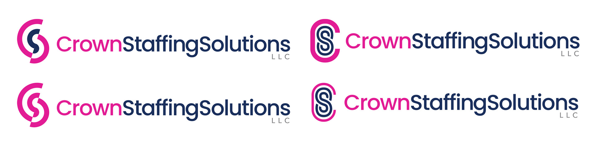
Round 4
Something about the target icon option stuck out to the client, so they asked me to compare that with a previous logo option from the Round 2 options, with some variations. Sent these back off to the client for deliberation.
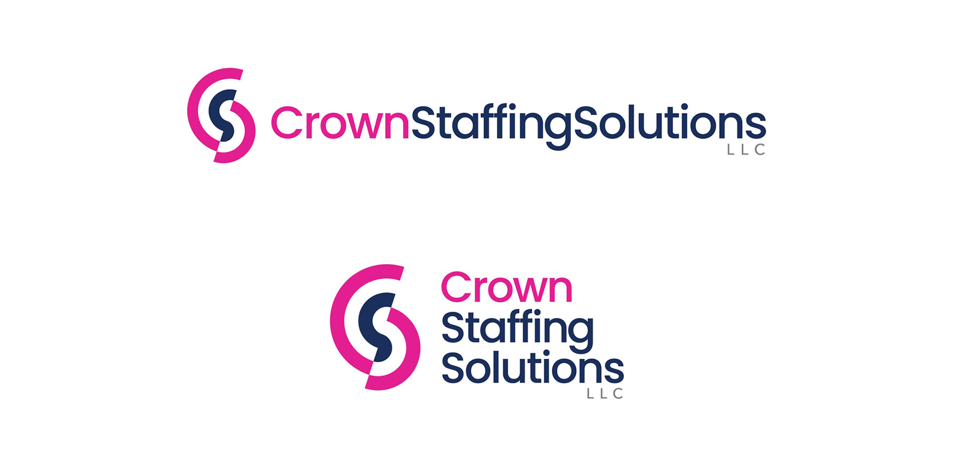
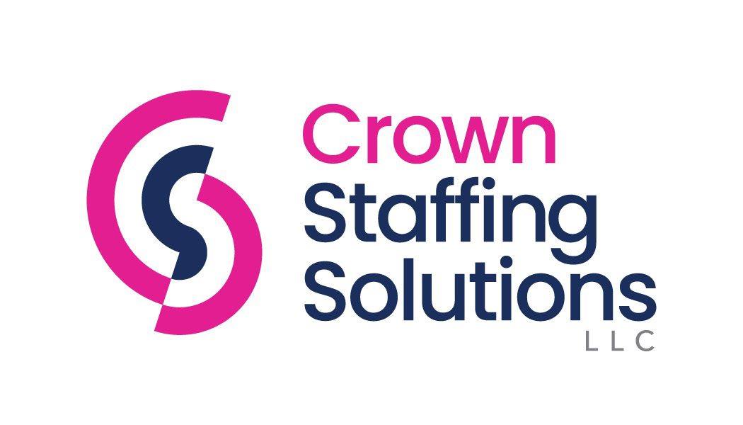
The client decided on this variation of the target icon logo, with both brand logos present. Once the logo was approved, I packaged up and sent the final print ready vector files for both the horizontal and stacked versions of the logo, in various full color, one-color black, and white reverse file formats. The client was pleased with the logo and featured it prominently in their marketing materials, newly redesigned website, and even their office space.
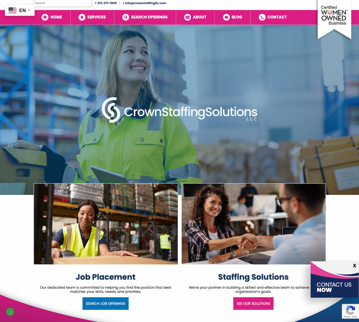
Updated website
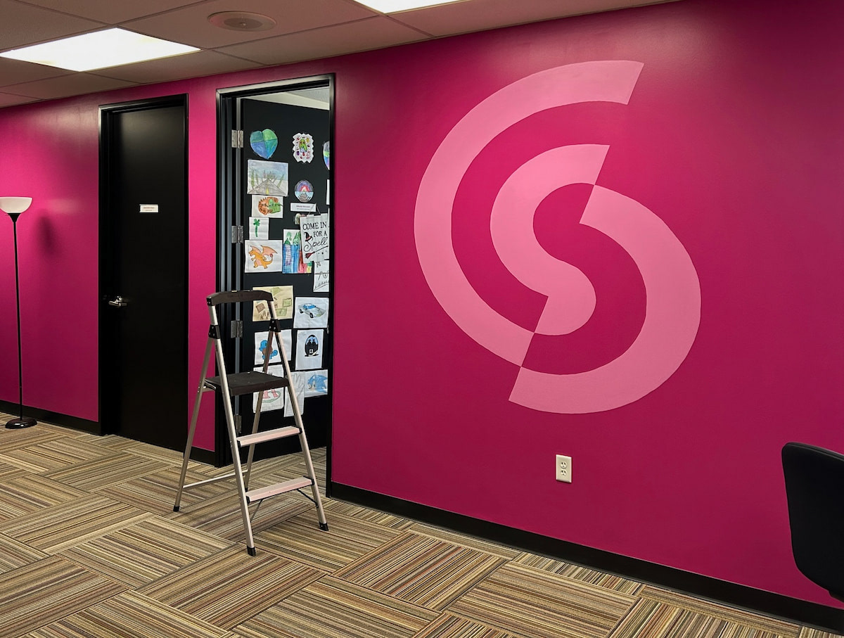
Office space mural